
Traditional Web3 Game Tutorials
Traditional Web3 Game Tutorials
Tutorial Introduction
The aim of this tutorial is to demonstrate the development of a Web3 game utilizing the Cocos engine and blockchain technology. It combines game development techniques with extensive blockchain expertise. Technology stacks and related tools During the development process, there are several essential tools that need to be prepared first. The following are what we recommend, but you can choose others with the same functionalities:
- Cocos Creator: Cocos Creator is the core engine needed in game development.
- Visual Studio Code: Visual Studio Code is the recommended IDE for game development.
- Google: Google's browser for game development.
- Nodejs : Nodejs environment tools for the game development process. MetaMask : MetaMask is a google plugin used in the game development process for the Ethereum wallet. Ethers: The core library of the chain used by Ethers in the game development process.
Development Tools
Cocos Creator
Cocos Creator is not only an efficient, lightweight, free and open-sourced cross-platform 2D&3D graphics engine, but also a real-time 2D&3D digital content creation platform. With the high performance, low power consumption, streaming load, cross-platform and many other advantages, you can use it to create games, vehicles, XR, metaverse and other fields of projects. Cocos Creator is a script-based, componentized and data-driven game development tool with content creation as its core. With an easy-to-use content production workflow and a powerful suite of developer tools, you can implement game logic and high-performance game effects. Cocos Creator document.
Environment Construction
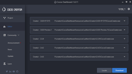
- Cocos Creator installation Please head to Cocos Creator to download and install the latest version of Cocos Dashboard. Cocos Dashboard provides a unified download and startup portal for each Creator engine. It supports unified upgrade and management tools for multiple creators and projects. You need to register a Cocos account before using it. Please register: registration.
The below image is the homepage of Cocos Dashboard. You can click the icon  to complete the language and other basic Settings. Project is the interface of the currently created project, which can be created and deleted; Editor is the interface of the editor, which displays the currently installed editors; Locate is the import ontology editor; Download is the download editor. Community refers to the community of Cocos. It encompasses the Cocos Store and other features, providing a platform for users to purchase various resources and engage with the community.
- Visual Studio Code installation Visual Studio Code is Microsoft's new lightweight cross-platform IDE that supports Windows, Mac, and Linux platforms and is easy to install and configure. Using VS Code to manage and edit project script code, you can easily implement syntax highlighting, intelligent code prompts, and more. Head to VS Code's official website and click the download link on the home page to download.
Mac users can double-click Visual Studio Code after extracting the download package.
Windows users run Setup.exe to complete the installation as prompted.
Set filtering
From the Visual Studio Code main menu, select File; Preferences; Or select Setting in the lower left corner
. At this time, type exclude search in the upper search box, and then click Add Pattern in the search.exclude and files.exclude modules to supplement the missing content, so as to remove the files or paths that do not need to be searched and displayed. An example format is (library/).Add a plug-in
There are a variety of VScode plug-ins, the combined use of plug-ins can make it easier for us to use vscode to view and compile code, improving the efficiency of reading and writing code. Here are several plug-ins recommended.
Auto Import
All available imports can be automatically found, parsed, and code actions and completions provided
Better Comments
It will help you create more human comments in your code, and you will be able to categorize comments using this extension.
Error Lens
It enhances language diagnostics by identifying diagnoses, highlighting entire lines when language diagnostics are generated, and printing messages inline.
Import Resources
1. Import
Cocos Creator provides three ways to import resources:
- To create a new file, go to Explorer → Panel → Create Button → Import resource in the Cocos Creator window.
- In the file manager of the operating system, you can copy the resource file to the project resource folder. When you open the editor or activate the editor window, the resource list of the resource manager is automatically refreshed and the resource is imported.
- Import resources by dragging and dropping files from the operating system's file manager to a folder in the Explorer panel.
All resource files will generate a .meta configuration file with the same name when imported. This configuration file provides the unique identification UUID of the resource in the project and some other configuration information, such as small map reference in the figure set, tailoring data of map resources, etc., which are necessary factors to identify a legitimate resource.
The .meta file is not visible in the resource Manager panel. The editor will automatically synchronize the corresponding.meta file of the resource when the resource is renamed, moved, or deleted to ensure that the configuration information such as UUID remains unchanged, that is, the existing references are not affected. You are not advised to perform operations on resource files in the file manager of the operating system. If any operations are performed, synchronize the corresponding .meta files.
- Close the editor you are using to prevent updates from failing due to file lock or the same resource name.
- When deleting, renaming, and moving resources, delete, rename, and move them along with the.meta file.
- If a resource is copied together with a.meta file, the copied.meta file is used instead of a new. If only the resource files are copied, a new.meta file with the corresponding name is generated.
2. Application
a. Texture
Image assets are generally created using image processing software (such as Photoshop, Paint on Windows, etc) and output into file formats that Cocos Creator can use, currently including JPG, PNG, BMP, TGA, HDR, WEBBP, PSD, PSD and TIFF. The application can be roughly divided into map, cube map, atlas, automatic atlas, font.
Texture assets are assets used for procedural sampling, such as textures on models and the UI on Sprites. When the UI or model are rendered, the corresponding texture is sampled, then filled on the model grid, plus a series of processing such as lighting to render the entire scene.
Texture assets can be generated from ImageAsset. Some common image formats, including .png, .jpeg, etc. can be used in ImageAsset.TextureCube is a cube texture, often used to set the scene's skybox. The cube texture can be obtained by setting the panorama ImageAsset to the TextureCube type, or it can be generated in the Creator. Atlas, also called a Sprite Sheet, is a common art asset in game development. Atlas is an asset for merging multiple pictures into a large picture through a special tool, and indexing through a file such as a .plist. Atlas assets available for Cocos Creator consist of a .plist and at least one .png file, although usually many .png files make up an Atlas. Auto Atlas is the picture-combining method that comes as part of Cocos Creator. Auto Atlas packs a specified series of images into a sprite sheet. This capability is very similar to the function of TexturePacker. LabelAtlas asset is a user-defined asset, it's used for configuring a LabelAtlas.
b. Prefab
Prefab is used to store some scene objects that can be reused, it can contain nodes, components, and data in components. The instances generated by the prefab asset can not only inherit the data of the template, but also have i's own customized data modification.
There are two ways to create a prefab: After editing the Node in the Scene, drag the Nodes directly from the Hierarchy panel to the Assets panel to complete the creation of the Prefab. Click the + button at the top left of Assets, or click the blank space of the panel, and then select Node Prefab.
There are two ways to create a prefab:
- After editing the Node in the Scene, drag the Nodes directly from the Hierarchy panel to the Assets panel to complete the creation of the Prefab.
- Click the + button at the top left of Assets, or click the blank space of the panel, and then select Node Prefab.
c. Font
There are three types of font assets available to games made with Cocos Creator: system fonts, dynamic fonts, and bitmap fonts.
The system font renders text by calling the system font that comes with the game running platform, and does not require the user to add any related assets to the project. To use system fonts, use the Use System Font property in the Label documentation.
Cocos Creator currently supports dynamic fonts in True Type format. Simply drag a font file with an extension of .ttf into the Assets panel, and you can import the font asset.The bitmap font is composed of a font file in .fnt format and a .png image. The .fnt file provides an index of each character thumbnail. When importing bitmap fonts, be sure to drag both the .fnt file and the .png file into the Assets panel at the same time. Note that after importing the bitmap font, you need to change the png file type to sprite-frame, otherwise the bitmap font will not work properly.
d. Audio Assets
Cocos Creator supports importing most common audio file formats, just drag and drop them directly into the Assets panel, and the corresponding AudioClip will be generated in the Assets panel after import.
e. Model Assets
Currently, Cocos Creator supports model files in FBX and glTF formats. FBX: FBX 2020 and earlier file formats are supported. glTF: glTF 2.0 and earlier file formats are supported. Please refer to the glTF models documentation for details.
f. Spine and DragonBones
There are two kinds of bone animation in Cocos Creator. Spine and DragonBones Bone animation. Currently, spine supports JSON and binary data formats. The DragonBones Animation resource is a data format exported by the DragonBones Editor (support for DragonBones v5.6.3 and below).
Game Introduction
Next, we will follow the introduction step by step to develop a simple game called Eating Stars, in this game you can see how Cocos Creator is developed and how Ethers is configured and applied. The game contains NFT assets, animation modules, state machines, functional class modules and so on. The game has achieved the logic closed loop: logon → start → end → settlement → start.
Set the Scene
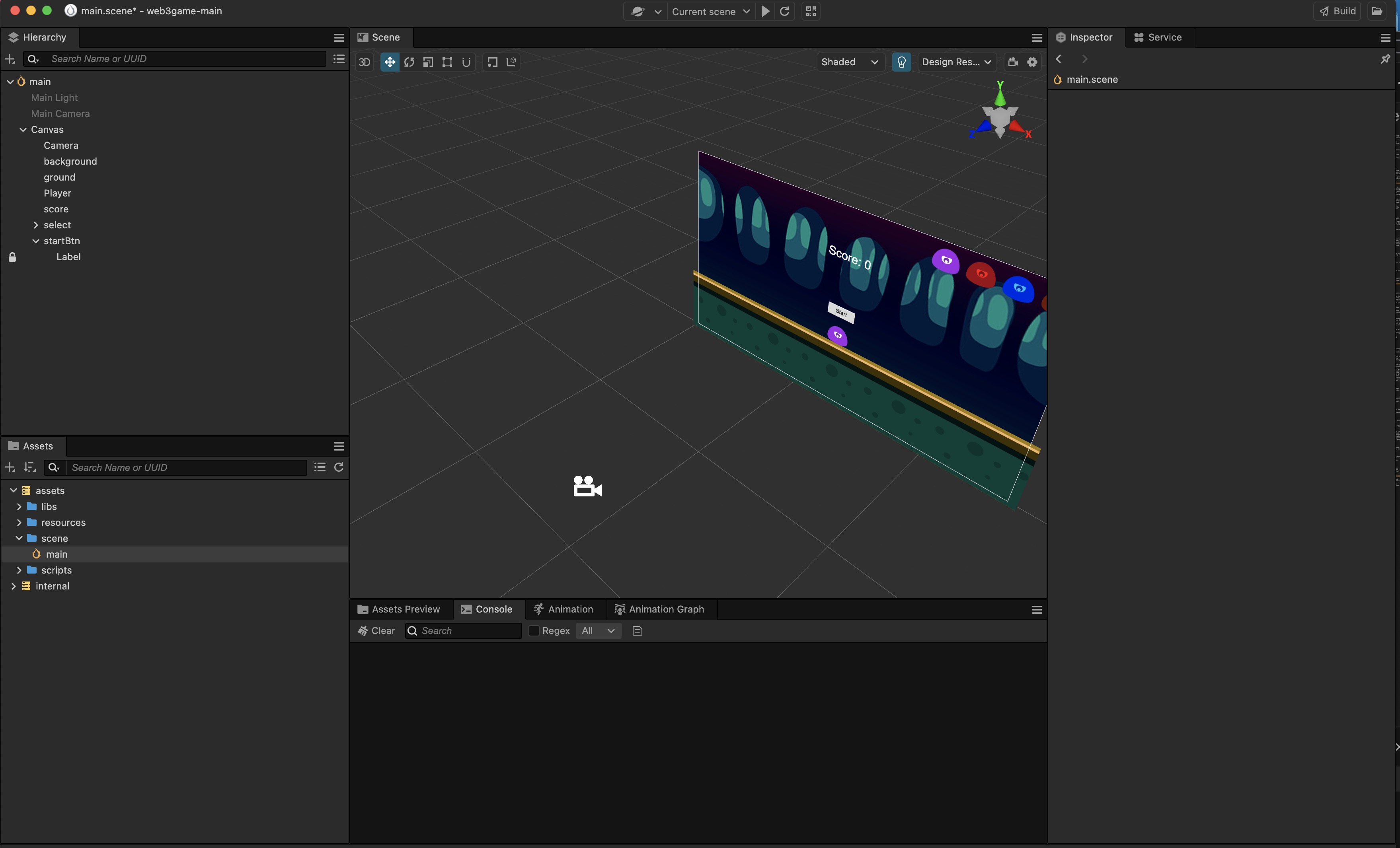
To begin with, I will introduce the editor of Cocos Creator. First, open the dashboard and select the empty 3D project we created in the project.
Hierarchy Manager: On the left side of the interface, the hierarchy manager displays all nodes in the current scene. In the hierarchy manager, we can observe the structure of all nodes of the current scene. In this interface, we can create, delete, move, and lock any node. And you can change the node name.
Resource Manager: The resource Manager is located below the hierarchy manager, where resources imported from third parties are stored. In the Resource Manager, you can delete and create resources, modify resource names, modify resource display and storage structure, and so on.
Property Inspector: The property inspector needs to select any node in the Hierarchy Manager and is displayed on the right side of the editor. The property inspector is used to view and modify any properties of the node. Or add custom functions and scripts to the node.
Scene Editor: The Scene Editor is the core work area for content creation. It is used to select and place game elements such as scene art, characters, special effects, UI, etc. In this work area, you can select and modify attributes such as node position, rotation, and scaling with the Transform tool, and get a preview of the scene effect. Scene editor includes 3D view and 2D view. 3D view is used for editing 3D scenes, while 2D view is mainly used for editing 2D elements such as UI nodes.
Click the 3D and 2D buttons on the interface to switch the 3D and 2D views of the scene editor.
 :Click the 3D and 2D buttons on the interface to switch the 3D and 2D views of the scene editor.
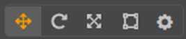 :The above tools are the transform tool set, responsible for the translation, scaling, rotation, adsorption, anchor point/center, local/world coordinate system and other functions of the node.
 :Switch the current scene transform tool to the displacement transform tool, and the shortcut key is W. The Move transform tool is activated by default when the editor is opened. If you select any node, you will see a movement control handle in the center of the node with three red, green and blue arrows and three red, green and blue squares. A control handle is a mouse - enabled controller displayed in the scene editor during a specific editing state. These controllers are used only to aid editing and are not displayed while the game is running.
- The Move Transform tool is active
- Hold down the red/green/blue arrow and drag the mouse to move the node in the direction of X, Y and Z respectively;
- Hold down the red/green/blue square and drag the mouse to move the node in the Y-Z, X-Z, and X-Y planes respectively.
 :Change the current scene transform tool to the Rotation Transform tool and set the shortcut key to E. The handle of the Rotary Transform tool consists of three orthogonal red, green and blue rings (an arrow and a ring in 2D view). Holding the red/green/blue ring at any point and dragging the mouse will rotate the node around the X, Y, and Z axes, respectively. When the mouse is hovering over any ring, the ring will be displayed as yellow. Click to select the ring. At the same time, a yellow arrow will be displayed, indicating which axis is the center of the current node rotation. Drag any point on the ring to rotate the node. Before releasing the mouse, you can see the rotation Angle on the control handle.
 :Change the current scene transform tool to Zoom Transform tool, and set the shortcut key to R. The scale transform tool consists of three axes with red, green and blue cubes at the head and a gray cube in the center. When the mouse is suspended on any cube, it will be displayed as yellow. Click to select and drag: hold down the red/green/blue cube and drag the mouse to scale the nodes in the X, Y and Z axis directions respectively; Holding down the gray cube and dragging the mouse will scale the node in the X, Y, and Z axes simultaneously.
 :Change the current scene transform tool to Rectangle Transform tool and set the shortcut key to T. Note that the Rectangle Transform tool only works on UI nodes. The rectangle transform tool consists of four vertex control points, four edge control points and one central control point. When the Rectangle Transform Tool is active: Drag and drop any vertex control point of the control handle to modify the Position property of the UI node and the ContentSize property of the UITransform component while keeping the diagonal vertex position unchanged. Drag any control point on either side of the handle to modify the Position (X or Y property) of the UI node and the ContentSize property (width or height property) of the UITransform component without changing the position of the opposite side. Dragging the central control point of the controller can modify the UI node's Position property and the AnchorPoint property in the UITransform component while the UI node's size remains the same. In the layout of UI elements, it is often necessary to use the rectangle transform tool to directly and precisely control the position and length of four sides of a node. The rectangle Transform tool is usually not used to resize image elements that must maintain the aspect ratio of the original image.
Add UI
In Cocos Creator, the powerful UI functions are always available which include the Button, Mask, Slider, ScrollView, EditBox, Progress, and more. Below, we will introduce the common UI components that will be used in the creator development process.
- The Button component responds to a click from the user. When the user clicks a Button, its status will change. In addition, users can assign a custom behavior to buttons' click events.
| Property | Function Explanation |
|---|---|
| Target | Specify the Button background node. When the Button status changes, the Color or Sprite property of the node will be modified. |
| Interactable | Boolean type, if set to false, then the Button component enters the forbidden state. |
| Transition | Enumeration type, including NONE, COLOR, SPRITE and SCALE. Each type corresponds to a different Transition setting. Please see the Button Transition section for details. |
| Click Event | List type, default is null. Each event added by the user is composed of the node reference, component name and a response function. Please see the Button Event section for details. |
- Layout:Layout is a component for UI container nodes. This component provides to the container various layout functionalities to automatically arrange all the children, so that the developer can make list, page, grid container, etc conveniently.
| Property | Function Explanation |
|---|---|
| Type | Layout type, including NONE, HORIZONTAL, VERTICAL and GRID. |
| ResizeMode | Resize mode, including NONE, CHILDREN and CONTAINER. |
| PaddingLeft | The left padding between the children and the container frame. |
| PaddingRight | The right padding between the children and the container frame. |
| PaddingTop | The top padding between the children and the container frame. |
| PaddingBottom | The bottom padding between the children and the container frame. |
| SpacingX | The spacing between children in the horizontal layout. NONE mode doesn't have this property. |
| SpacingY | The spacing between children in the vertical layout. NONE mode doesn't have this property. |
| HorizontalDirection | When it is designated as a horizontal layout, this property determines which side(left or right) does the first child node start in the layout. When the Layout type is set to GRID, this property along with Start Axis property determine the starting horizontal alignment of GRID layout elements. |
| VerticalDirection | When it is designated as a vertical layout, this property determines which side(top or bottom) does the first child node start in the layout. When the Layout type is set to GRID, this property with Start Axis property determines the starting vertical alignment of GRID layout elements. |
| CellSize | This property is only available in GRID layout, CHILDREN resize mode, and determines the size of each child node. |
| StartAxis | This property is only available in GRID layout, and determines the arrangement direction of children. |
| AffectedByScale | Whether the scale of the child node affects the layout. |
| AutoAlignment | Auto-alignment, in type HORIZONTAL or VERTICAL mode, ensures that the other axial value is zero. |
| Constraint | Layout constraints that constrain the number of alignments in a given direction, supporting NONE, FIXED_ROW and FIXED_COL. |
| ConstraintNum | The layout constraint value, valid in Constraint of type FIXED_ROW or FIXED_COL mode. |
- EditBox: EditBox is a text input component. Using this component could get user input easily.
| Property | Function Explanation |
|---|---|
| BackgroundImage | The Sprite component attached to the node for EditBox's background |
| FontColor | The input text color of EditBox |
| FontSize | The input text size of EditBox |
| InputFlag | Specify the input flag: password or capitalized word. (Only supports Android platform) |
| InputMode | Specify the input mode: multiline or single line |
| LineHeight | The input text line height of EditBox |
| MaxLength | The maximize input characters of EditBox |
| Placeholder | The text content of EditBox placeholder |
| PlaceholderFontColor | The text font color of EditBox placeholder |
| PlaceholderFontSize | The text font size of EditBox placeholder |
| PlaceholderLabel | The Label component attached to the node for EditBox's placeholder text label |
| ReturnType | The keyboard return type of EditBox. This is useful for keyboard of mobile device |
| String | The initial input text of EditBox, which displays the text of the placeholder if not set |
| TabIndex | Set the tabIndex of the DOM input element, only useful on the Web |
| TextLabel | The Label component attached to the node for EditBox's input text label |
- ScrollView is a container with a scroll function. It provides a way to browse more contents within a limited display area. Generally, ScrollView will be used along with the Mask component and the ScrollBar component can also be added to show the current offset location within the browsing content.
| Property | Function Explanation |
|---|---|
| BounceDuration | Floating point number, the time duration for bounce back. The value range is 0-10 |
| Brake | Floating point number, the deceleration coefficient after scrolling. The value range is 0-1. If set to 1, then the scrolling will stop immediately, if set to 0, then the scrolling will continue until the content border |
| CancelInnerEvents | If it is set to true, then the scroll behavior will cancel the touch events registered on the child node. The default setting is true |
| Content | A reference node for the inner content of the ScrollView. It could be a node containing a very large image or long texts. |
| Elastic | Boolean value, whether to bounce back or not while scrolling to the border. |
| Horizontal | Boolean value, whether horizontal scroll is allowed or not |
| HorizontalScrollBar | A reference node for creating a scroll bar showing the horizontal position of the content |
| Inertia | There is an accelerating velocity when scrolling |
| ScrollEvents | Default list type is null. Each event added by the user is composed of the node reference, component name and a response function. Please see the ScrollView Event section for details. |
| Vertical | Boolean value, whether vertical scroll is allowed or not |
| VerticalScrollBar | A reference node for creating a scroll bar showing vertical position of the contents |
- Slider: Slider is a component for the production of UI components such as volume adjustment.
| Property | Description |
|---|---|
| Handle | The button part of the Slider that allows to adjust value by sliding the button |
| Direction | The direction of the slider, including Horizontal and Vertical |
| Progress | Current progress value, the value range is 0 ~ 1 |
| SlideEvents | Slider component event callback function |
- Toggle: The Toggle component is a CheckBox. When it's used together with a ToggleContainer, it could be treated as a RadioButton.
| Property | Function Explanation |
|---|---|
| IsChecked | Boolean type. When set to true, enable the check mark component |
| CheckMark | Sprite type. The image displayed when Toggle is selected |
| CheckEvents | List type, default is null. Each event added by the user is composed of the node reference, component name and a response function. Please see the Toggle Event section below for details |
Add Game UI
Now let's create a basic game structure node tree. Step by step, we will improve the node function to make a simple game.
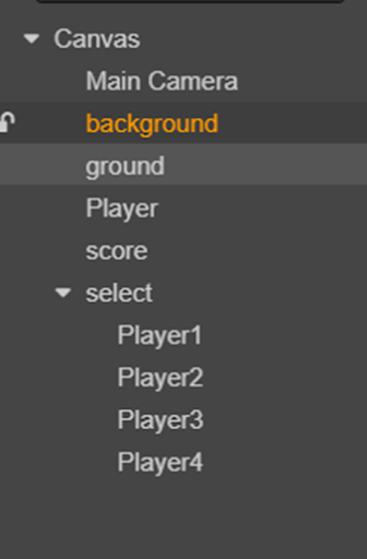
- To create a background, right-click the parent node in the Hierarchy Manager. Create a node. Create render node; Create a sprite and name it background. Select the node we just created and find the spriteFrame property in the Sprite component in the property inspector. Locate the spriteFrame resource name background in Explorer and drag it over the property you just created. Set the image size to the canvas size. So we're done creating the background
- Now let's create a ground, the ground is created in the same way as the background, but with different resources. The resources on the ground are ground.
- Once again create a sprite node named player, which we will later add functionality to make a character that always jumps and eats stars.
- Create other nodes. A Label named score is used to record the score. Create a select parent node. Add different characters inside, as the subsequent selection of characters function nodes.
When we've done this, you'll see a tree of nodes that looks like this.
Add a player
We need to right-click the location of the parent node we want to add in the hierarchy manager. Create a node. Create render node -> Create a sprite. At this point we create a 2dui Sprite. Now let's add functionality to this 2D Sprite and turn it into a character. Right-click scripts in Explorer and go to New -> The JavaScript then names Player, and we get a Component named Player. Now let's add functionality to the Player.
First of all, we need to get the player moving, and here we need to use the powerful animation system Tween in creator. Using the tween system we can make objects shift, rotate, scale, color, whatever else we can think of, and we can add all kinds of mathematical curves to the animation to add different rates of change to the animation. Now let's apply it. The by() method is how much to change the property, as opposed to the to() method, which is how much to change. easing makes changes to follow the sineOut curve as you make changes. The Sequence() method creates a sequential animation queue. The Call() method is the callback after the animation completes. RepeatForever() to create an animation that is repeated forever.
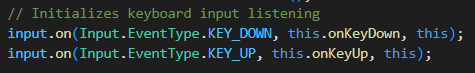
Now that we've created the animation, we need to animate the player Sprite to get it moving. And the way to do that is to get the animation moving. The object to be executed is this.node, and the start() method is to start the animation. Now we need the player to be able to receive external actions, and this is where we need to use the listening system. We have a very powerful listening system in creator that can receive external touches, keystrokes. Mouse and so on operation, here we need to use the monitoring of the case, the specific method is as follows. input.on() adds a listener to the system event. KEY_DOWN and KEY_UP are the monitored events, which are keyboard down and keyboard up respectively. this.onKeyDown and this.onKeyUp are the methods to be executed while listening for the event. this represents the object of the method to be executed.
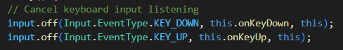
The following is to cancel the listening event written, the difference is that the on method is changed to off. The important thing to note here is that the object of the method and the method executing need to be the same.
When we receive an external event, we need to handle the event. Here is a simple event handling method. event is our upcoming event data. We process and analyze even data and record the left or right state. After we get the left or right state, we change the position of the player node in the update method (which is executed every frame) to make a move. In the following method we can see that we have determined whether to move left or right. An xSpeed speed is then recorded and a cumulative change is made to the x position of the node, with a limit to the maximum speed set. This is one of the core logic we added to the player node and the functionality of the player node.
Add Game Script
Before we have got a player who can operate the movement, now let's add the game logic, adding the game logic is divided into three parts, respectively, adding the star logic, adding the collision logic, scoring logic next we will explain the implementation of the game script from these three parts.
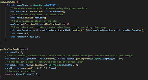
a. The idea is that the stars disappear over time. If touched by the player, the star will immediately disappear, then another star will appear on the screen. First we need to create a star node just like we created a player, and then we need to create a script named star. Now let's implement the vanishing logic and the logic of random occurrences.
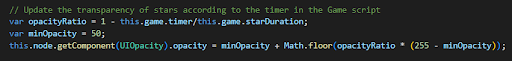
b. We need to implement the vanishing logic in the update. In the missing logic we need to change the transparency property, so we need to add a component of UIOpacity to the star, which is a transparent function of the empty current node and the child node. Let's look at the calculation below. First we need to calculate a coefficient as follows: transparency coefficient =1 - current survival event/total survival time. We then use this coefficient to change the transparency of the current node. The specific
formula is: transparency = minimum transparency + transparency coefficient * (maximum transparency -- minimum transparency). Here is the implementation code
c. Drag the star node to the Explorer to make a preset. Define a starPrefab property in the game script to store the presets you just defined.
d. Stars disappear or collide and we need to recreate stars. To create stars, we need to use a method named instantiate, which will create a prefab or node like the target node and return it, and then use the random method to randomly appear in the design resolution. It is important to note that the random height needs to be within the height that the player jump can hit. Here is the implementation code, which adds to the scene and sets the position and also initializes the node's lifetime data.
Collision logic
a. Collision judgment. The collision judgment needs to be implemented in the star script of the star. The idea of realization is to judge the distance between star node and character node in each frame. When the distance reaches a threshold, we know that a collision has occurred. Firstly, the current player position is obtained by using Player. getPosition method, and then the two-dimensional vector of distance is obtained by using the subtract method, and the pixel to the distance is obtained by using length() method.
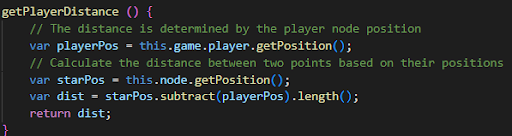
Then we execute the getPlayerDistance method in the update method to get the distance and threshold to judge whether the collision event is started.
b. Collision event. At the time of the collision. We need to call the previously implemented logic for creating a new star node and scoring logic, and also call the destroy method to destroy the own node. This completes a simple and efficient collision logic.
Scoring logic
When the collision logic occurs, our scoring logic will be called. The core of the scoring logic is to create a score property to accumulate and record our scores. Every time the logic is called, the cumulative score is notified to modify the score node we created in ui to refresh the displayed scores. Here is the implementation code
Game over
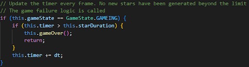
The logic of the game ending is very simple, based on the star survival time we created compared to the current display time, when the displayed time is longer than the survival time, we decide that the game is over. The following is an implementation of the judgment we make at each frame. At the end of the game we need to call stopAllAction to stop all animations.
Select player
Now that we've completed the basic features of the game, let's add a selection feature to the character. First we need to create a component named select, adding the component we just created to the node where the select was created. Now let's add selection to the component.
First we need to define a property named player and of type Sprite, which will hold the external player node. Secondly, we use the map method to facilitate the child node of the select node and add a TOUCH_END listener to the child node to listen for the touch press operation.
And then we're going to replace the player character, and in this case we're going to directly change the color property of the player to distinguish heroes, and as we can see in the code down here, in even listening data, We take the color property of the currentTarget and assign it directly to the color property of the player.
These are all the functions of our selected characters.